“`html
Essential Guide to How to Read a Histogram
Reading a histogram effectively is vital for improved data analysis, particularly as the volume of data continues to grow in 2025. Histograms not only provide insightful statistical information but also offer a visual representation of data distributions. In this guide, we’ll explore the basics of histograms, their construction, various types, and how to interpret them for better decision-making.
Understanding Histograms
A histogram is a type of bar chart that represents the frequency distribution of numerical data. Unlike traditional bar graphs, histograms represent data by placing numbers into ranges (known as bins), displaying how many values fall within each range. This visual data representation is essential when you’re analyzing large data sets, allowing you to quickly grasp data distribution and trends. Understanding the key features and **characteristics** of a histogram is vital for effective **histogram analysis** and can aid in making informed decisions based on the data presented.
Histogram Basics
At its core, a histogram displays data frequency across various intervals. Each bar in the histogram corresponds to a bin; the height of the bar indicates the frequency of data points within that bin. For example, if you are conducting an analysis on test scores of students, a histogram can help visualize how many students received scores in specific ranges, providing insights into overall performance trends. Recognizing histogram basics will assist in developing a strong foundation for advanced **histogram interpretation** techniques.
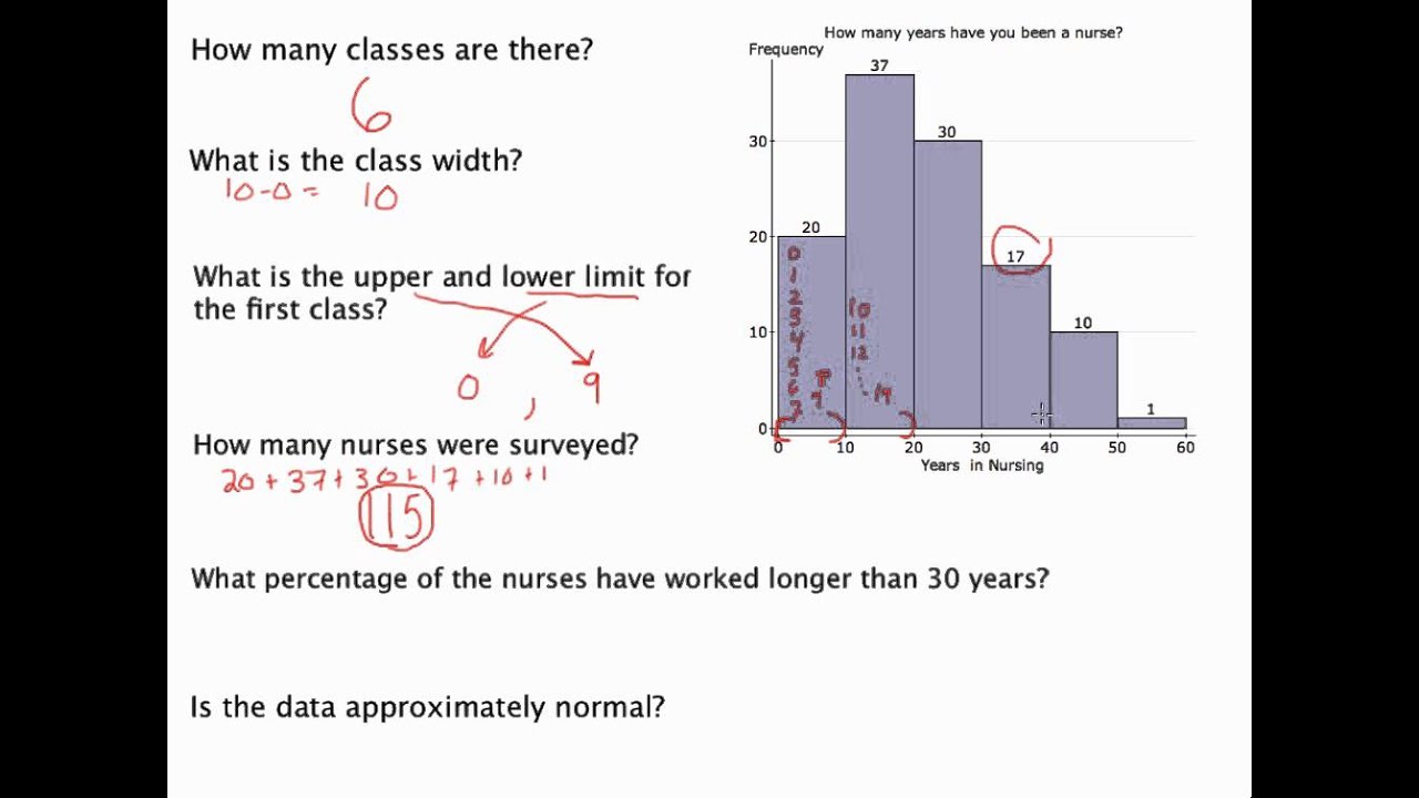
Steps to Read a Histogram
Reading a histogram involves a few essential steps. First, identify the x-axis, which represents the data ranges or bins, and the y-axis, which indicates frequency counts. Next, observe the height of each bar to understand the number of data points falling into each bin. For successful **histogram interpretation**, take note of the width of the bins, as varying widths can affect overall visualization clarity. Following these steps will enable managers or analysts to effectively comprehend and utilize the data represented in a histogram.
Histogram Features
Different **histogram features** include shape, spread, and center. The shape can informally categorize the data distribution as normal, skewed, or bimodal, while the spread indicates how dispersed the data points are. For instance, a narrow histogram implies that data is closely packed around the mean, whereas a spread-out histogram suggests greater variance. Identifying these features is crucial for gaining profound insights from your data, especially in comparative analysis.
Histogram Construction
Constructing a histogram requires a systematic approach. To begin, you need to select appropriate data for your analysis, determine bins (the ranges of data), and decide the frequency for each bin. **Creating histograms** carefully ensures clearer communication of data insights. Once constructed, it’s vital to assess aspects such as bin width and the total number of bins, as these elements influence the **interpretation of histogram shapes** and clarity. By following a structured construction method, individuals can present data in a visually appealing and easily digestible format.
Types of Histograms
Various **histogram types** exist, catering to different data sets and analytical needs. Frequency histograms illustrate the number of data points in each bin, whereas cumulative histograms show the total percentage of data points up to each bin. Understanding these different types is essential for selecting the appropriate visualization tool depending on the analysis objective. Furthermore, each type can highlight unique insights when analyzing specific trends or distributions.
Histogram Evaluation Techniques
To achieve effective **histogram evaluation**, recognize the significance of aspect ratios and bar widths. Too narrow bars can result in an overly complex interpretation, while excessively wide bars may hide essential data patterns. Employing statistical tools to analyze histograms further aids in evaluating trends, observing outliers, or overlapping values which could denote significant changes in data behavior. Effective evaluation techniques ultimately lead to more accurate interpretations of the given data.
Histogram Insights for Data Analysis
The insights derived from **histogram analysis** span across various applications. In fields such as healthcare, finance, and social sciences, histograms can reveal demographic trends, financial distributions, or social behaviors effectively. Leveraging these insights can empower organizations to strategize better, allocate resources, or improve outcomes. By systematic observation of **histogram patterns**, analysts can harness these insights for more significant impact.
Reading Histogram Graphs
Learning the nuances of **reading histogram graphs** contributes immensely to mastering data visualization. Whether you are analyzing customer feedback scores or sales data, recognizing histogram shapes allows for rapid insight extraction. This section will outline practical steps and considerations that can enhance your ability to read and interpret these graphical representations effectively, fundamentally bolstering your statistical analysis skills.
Interpreting Data Distributions
Effective interpretation of data distributions through histograms is about recognizing trends and gaps in the data. For instance, a histogram that shows a sharp peak suggests that most data points are clustered around a specific value, whereas a scattered distribution may indicate a more diverse dataset. To improve your interpretation, leverage comparative analysis techniques with additional data representations where necessary. Utilizing tools and software designed for graphical data representation can also simplify the process, ensuring clarity and enhanced insights into your data grouping.
Practical Example of Histogram Analysis
Consider a real-world application in analyzing data from a recent sales campaign. By plotting monthly sales figures into a histogram, one could reveal the distribution of sales activity over several months. Observing the resulting graph may show a large volume of sales in specific months, indicating successful campaigns, or stark declines during off-peak seasons. Such visualizations help significantly in evaluating performance standards, strategizing future campaigns, and optimizing resource allocation. This case study illustrates how a clear understanding of **histogram evaluation** leads to expertly derived insights from significant datasets.
Advanced Histogram Techniques
As data visualization techniques evolve, **advanced histogram techniques** have become available to enhance analysis accuracy. Techniques such as kernel density estimation can provide more ended insight into data distributions beyond conventional histograms. The inclusion of frequency polygons alongside histograms provides additional clarity as it allows for a smooth representation of the data. Combining these methods with statistical significance tests can solidify your understanding and augment data analysis capabilities, paving the way for better predictive modeling.
Key Takeaways
- Histograms are critical for understanding data distribution and trends.
- Key components of a histogram include the shape, bin width, and frequency count.
- Continuous evaluation and interpretation can lead to valuable business insights.
- Effective histogram construction and analysis techniques enhance data understanding.
- Embracing advanced techniques can elevate traditional histogram applications for complex datasets.
FAQ
1. What is a histogram, and what is its significance in data analysis?
A histogram is a graphical representation of the frequency distribution of a dataset. It is significant because it enables analysts to visualize data trends, distributions, and patterns clearly, providing insights that aid decision-making processes.
2. How do I create a histogram?
To create a histogram, first organize your data into reference bins, count the data frequency for each bin, and then plot the results on the x and y axes, respectively. Tools like Excel, Python, or statistical software can assist in histogram construction.
3. What are the common features of histograms that I should look out for?
Key features include shape (uniform, normal, skewed), center (mean, median), and spread (how dispersed data points are). Understanding these features can enhance your **histogram interpretation**.
4. Can histograms be used for categorical data?
While typically used for continuous data, histograms can represent categorical data if transformed into numeric formats or by using frequency distribution to approximate data plots visually.
5. What mistakes should be avoided while reading histograms?
Common mistakes include ignoring bin width and misinterpreting the shape of data distributions. It’s crucial to consider the total number of data points and their placement within bins for accurate analysis.
“`